Battle of the Bands
For five years, I played a key role in shaping the visual identity of Ramsey’s Battle of the Bands, ensuring each year's event felt fresh, exciting, and unique. My work spanned multiple disciplines, from print design to motion graphics, all while capturing the energy and personality of different bands.
The Nebraska Years (2021)
This poster marked my breakthrough into Battle of the Bands design. Created for a pop-punk-inspired band, The Nebraska Years was named after Rachel Cruze’s early speaking days, which frequently took her to Nebraska. The design captured the band’s energetic and rebellious spirit, setting the stage for a dynamic performance.
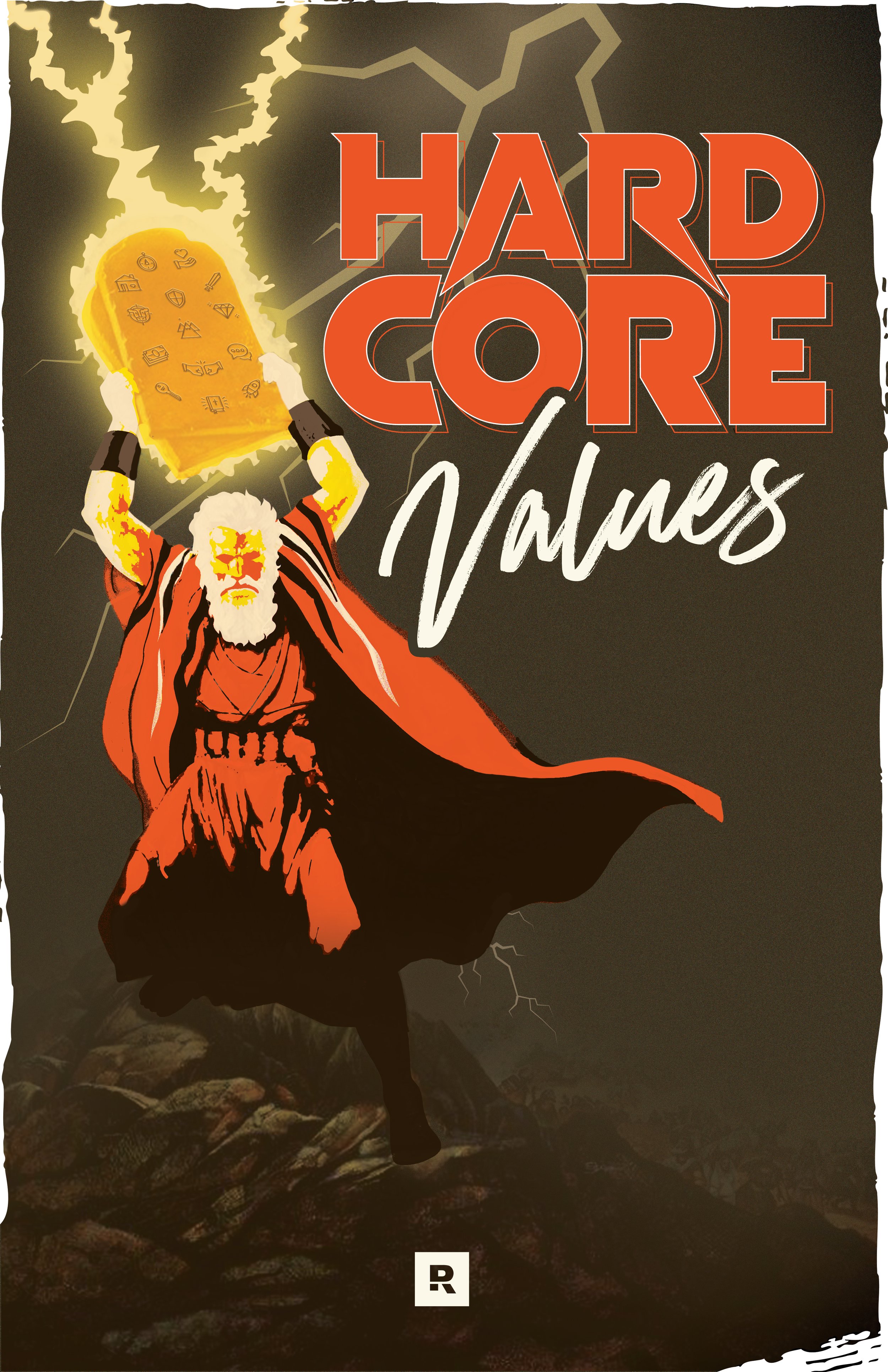
Hard Core Values (2022) | 1st Place Winner
This poster took first place in the Battle of the Bands poster competition—not just for its design, but because it made the team laugh out loud while perfectly capturing the relatable humor behind the band’s concept.
Hard Core Values was a hardcore metal-inspired band that played off Ramsey Solutions' core values, blending brutal intensity with inside-joke gold. My design was heavily influenced by Dio’s “Rainbow in the Dark” and Charlton Heston’s legendary stance on The Ten Commandments cover.
Using a mix of heavy Photoshop work, custom illustration, and a whole lot of humor, I transformed this idea into the most epic, over-the-top metal poster—and it showed!
The Tik Taks (2023)
Inspired by Dave Ramsey’s affectionate misnaming of TikTok, The Tik Taks embraced a doo-wop, clean-cut, good old-fashioned fun aesthetic. The band’s branding balanced 1950s charm with a modern twist, making for a visually clever and nostalgic identity.
For the poster design, I played off the band’s name by creating a Tic Tac container-shaped layout, using TikTok’s color palette to subtly tie the joke together. The logo was kept classy and vintage-inspired, reinforcing the band’s throwback style.
Beyond print, I also stepped into the world of animation for the first time. With Ramsey needing more animators that year, I took on the challenge of creating a looping background animation that played during the band’s performance—bringing the energy and movement of the 50s era to life on stage.
Tragic Kingdom (2024)
After my first-place win with Hard Core Values, I was sought out by this band to design their poster—partly because of my love for Disney and partly because they knew I could bring their pop-punk-meets-metal vision to life.
The concept was Disney with a twist—a reimagining of the Sleeping Beauty castle, infused with gritty edge and rebellious energy. I leaned into deep purples and eerie greens, the signature hues of Disney villains, to set the perfect tone. The edges of this poster are rounded and the edges are frayed to mimic the feeling of a VHS cover.
From the first sketch to the fully vectorized final design, I loved every second of bringing this world to life. And beyond the poster, I also designed a custom t-shirt to give the band a complete, cohesive look.


